Our customers have been hired at: *Foot Note
In today’s competitive job market, hiring managers often sift through dozens of applications for a single position. To stand out, you’ll need a clear, concise, and visually appealing resume.
But what exactly does a good resume look like? From formatting tips to content layout best practices, this guide will cover what a resume should look like to impress recruiters and win interviews.
What Should a Resume Look Like?
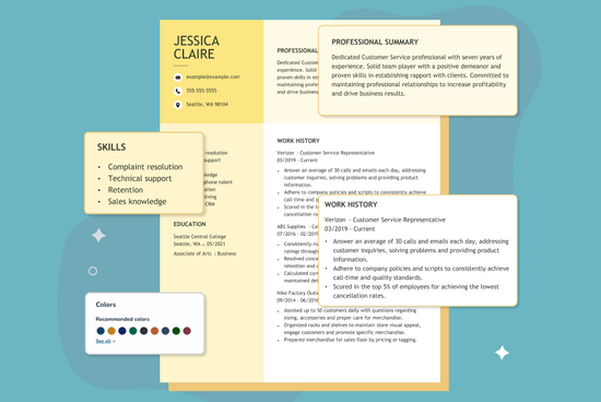
Simplicity is key in modern resume design. Rather than relying on complex design elements to catch the recruiter’s eye, opt for a polished layout that lets your skills and qualifications shine.
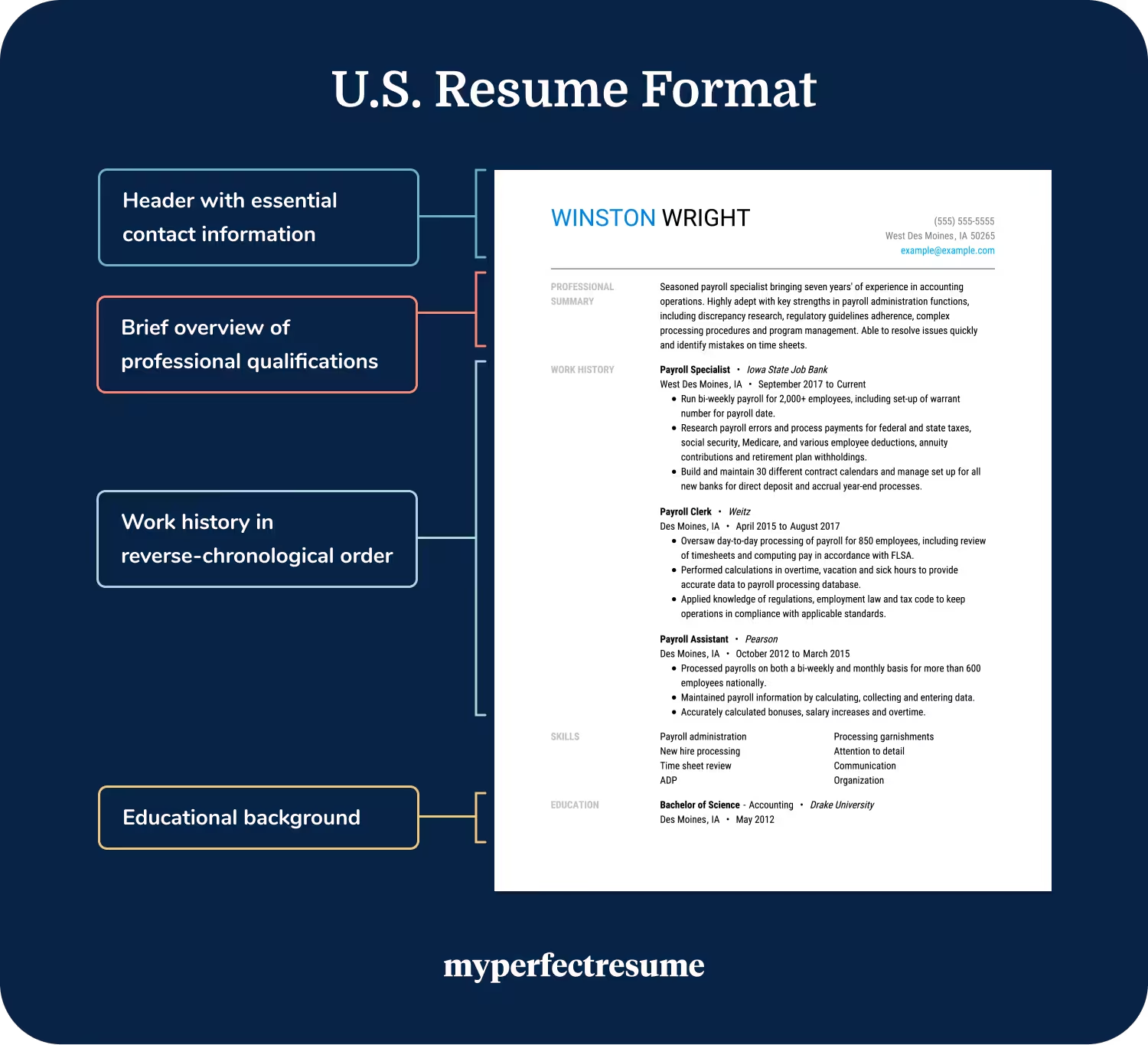
Explore our library of professional resume examples for samples tailored to various jobs, industries, and experience levels. The example layout below showcases what a resume should look like:
Formatting Best Practices
Our career advice professionals outlined expert tips for designing and formatting a resume that effectively showcases your skills, experience, and qualifications.
1. Make your header clear and readable
Your resume header should be bold, clear, and easy to read, ensuring your name and contact information stand out at a glance so that hiring managers can contact you for an interview.
Use a professional font, slightly larger than the body text, and keep the layout clean with adequate spacing. Avoid unnecessary embellishments — clarity and professionalism are key.
You can use our Resume Builder to create a resume with a clear and bold header that demonstrates your professionalism and attention to detail.
2. Use a professional font
Choose a modern and easy-to-read font for your resume, such as Arial, Calibri, Helvetica, Courier, or Times New Roman. Avoid using outdated or overly decorative fonts, such as Broadway or Magneto.
One of the primary goals when writing a resume is to make the document easy to read. You accomplish this by using a classic, clean font.
To simplify this process, you can customize one of our resume templates in our Resume Builder, where you’ll have a variety of professional fonts to choose from.
3. Incorporate color strategically
While adding color to your resume can make it stand out, it's important to use it sparingly and strategically. Avoid using colors and combinations that will hinder its readability.
Stick to a maximum of one to two colors, and use them consistently throughout your resume.
If you’re in the creative industry, you might have some more leeway to use color and design. Check out our creative resume templates for some inspiration or help.
4. Balance text with whitespace
Using white space effectively in your resume enhances readability and creates a clean, professional look. It also makes it easier for recruiters to quickly find key information.
Adequate spacing between sections, margins, and bullet points helps guide the reader’s eye and prevents your resume from looking cluttered. For example:
5. Maintain consistent formatting
Maintaining consistent formatting in your resume ensures a polished, professional appearance. Use the same font, spacing, and bullet style throughout to enhance readability and organization.
Clear organization is particularly important for your resume work history section, which should be uniform so that hiring managers can easily see what makes you a great fit for the role.
Once you’ve added your past work experience and packed each entry full of resume keywords and skills from the job description, double-check that your formatting is consistent.
Start by ensuring that each entry lists the company name, location, and dates of employment in the same order. Next, check that your bullet points are aligned and that your margins line up.
Explore the best resume formats for guidance on selecting a format that accurately and effectively presents your job-relevant skills and experience.
Content Layout Best Practices
In addition to ensuring a clean and polished layout, your resume content should be structured to effectively present your qualifications. Browse the best practices below to get started.
1. Simplify your contact information
To simplify your contact information on your resume, include only the essentials. Add your name, phone number, email address, and professional networking profile if relevant.
Avoid unnecessary details like full mailing addresses, multiple phone numbers, or personal social media links. These can add visual clutter to your resume.
For a consistent and polished application, ensure that your cover letter header includes the same information listed in your resume header.
2. Shorten your professional summary
A professional summary sits at the top of your resume beneath your header. Its purpose is to offer recruiters a quick snapshot of your experience and qualifications.
Summaries should be short — no longer than three to five sentences. The idea is to draw the reader in and encourage them to continue reading the rest of your resume.
A well-written professional summary succinctly explains what you’ll bring to the table if you are hired. Here is an effective example:
“Results-oriented marketing professional with over seven years of experience driving revenue growth and brand awareness through digital campaigns, including SEO, SEM, and social media. Skilled in market analysis, competitor research, and customer segmentation to identify opportunities and deliver impact.”
3. Tailor your skills section to the job
Always aim to incorporate the skills emphasized in the job description. Skills typically added to resumes include hard skills (like software or technical expertise) and soft skills (like communication skills or time management skills).
According to an eye-tracking study conducted by Ladders, recruiters spend an average of six seconds reviewing an individual resume.
Candidates have just seconds to make a strong first impression and convince a recruiter to delve deeper into their qualifications.
Including a bulleted list of highly relevant skills at the top of your resume draws the recruiter's eye to the key qualifications that make you a great fit.
4. Condense your information to one page
Whenever possible, a one-page resume is ideal for ensuring a clear, impactful presentation of your qualifications.
To condense your resume to one page, focus on relevant experience, use concise bullet points, and eliminate unnecessary details.
Prioritize key achievements over job descriptions, use a clean layout with strategic white space, and adjust font size and margins without sacrificing readability.
A two-page resume is acceptable if you have more than 10 years of highly relevant experience. If you use two pages, ensure that the entire second page is filled for a professional layout.
5. Check for spelling and grammar errors
Even if your resume looks polished and professional, typos and grammatical errors can undermine the benefits of a visually engaging layout.
Read your resume twice or even three times, then send it to a friend for proofreading. A fresh set of eyes will quickly find mistakes you didn’t see.
We recommend scanning your resume with our free ATS Resume Checker to receive instant feedback on opportunities for improvement.
Examples of What a Good Resume Looks Like
The following resume examples demonstrate how to apply the formatting and content best practices above to each of the three primary resume formats — chronological, functional, and combination.
Chronological
Functional
Combination
Key Takeaways
- Keep it clean and professional: Use a simple, well-structured layout that highlights your skills and experience without unnecessary distractions.
- Use a clear and readable header: Ensure your name and contact information stand out with a bold, easy-to-read format.
- Use white space effectively: Avoid clutter by incorporating adequate margins and spacing between sections for better readability.
- Maintain consistent formatting: Use a uniform font, spacing, and bullet style to create a polished, professional appearance.
- Focus on relevant content: Tailor your resume to the job by emphasizing key skills, achievements, and experience that align with the role.
- Keep it concise: Aim for a one-page resume by eliminating redundant information and prioritizing the most impactful details.
- Proofread for errors: Typos and inconsistencies can make a bad impression, so carefully review your resume before submitting it.
FAQ
What does a mobile-friendly resume look like?
With more and more employers using mobile devices to review resumes, it’s important to design your resume with mobile in mind. Here are some tips for creating a mobile-friendly resume:
- Simple design: Avoid complex designs, graphics, or fonts that may not display properly on a mobile device. Stick to a simple, easy-to-read format with clear headings.
- Legible font: Use a legible font that is easy to read on a small screen, such as Arial, Calibri, or Verdana. Avoid using small or complex fonts that may be difficult to read.
- Bullet points: Use bullet points to break up long blocks of text and make your resume easier to scan. Use clear, concise language to describe your skills and experience.
- Compatible format: Make sure it is saved in a compatible format, such as PDF or Word so that it can be easily viewed on a mobile device.
A mobile-friendly resume should be simple and easy to navigate on a small screen. Use a responsive design that adapts to different screen sizes, and avoid using large files or complex layouts that may not load quickly on mobile devices.
How should a resume look to stand out?
A standout resume should be well-organized, easy to read, and visually appealing. Here are some key elements of what a good resume should look like:
- Clear and concise summary: A great resume should start with a clear and concise summary statement at the top that highlights key accomplishments and experience.
- Skills and qualifications: Include a section highlighting your key skills and qualifications, such as technical skills, language proficiency, or leadership abilities.
- White space and formatting: To make your resume easy to read, use white space and formatting elements like bullet points, bold text, and headings.
- Tailored to the job: Customize your resume for each job you apply for, highlighting the skills and experience that are most relevant to the position.
See our resume About Me section guide for tips on incorporating an introductory paragraph into your resume, which can help you stand out to employers.
What does a resume look like for a first job?
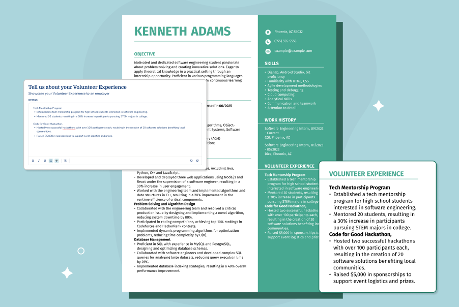
A resume for your first job should be clean and simple, highlighting your skills, education, and relevant experience, such as internships or volunteer work.
Even without prior work experience, a well-structured resume can showcase your potential and make a strong impression on employers. Here are a few tips to help you get started:
- Start with a strong objective statement: Begin with a clear and concise objective statement that outlines your career goals and highlights your skills and qualifications.
- Keep it simple and easy to read: Your resume should have a clean and simple design, with plenty of white space and legible font.
- Focus on education and extracurriculars: If you don’t have much work experience, focus on your education and any relevant extracurricular activities or volunteer work.
- Use action-oriented language: Use strong action verbs on your resume that demonstrate your impact in prior volunteer or extracurricular roles.
Explore how to write a resume without experience for more tips on how to craft a compelling resume for your first job.
What does an ATS-friendly resume look like?
An ATS-friendly resume is designed to be easily read and parsed by automated applicant tracking systems (ATS) that many employers use to screen resumes.
Here are some tips for creating an ATS-friendly resume design:
- Avoid using images or tables: Images, tables, and other graphics can confuse an ATS and cause it to reject your resume. Stick to simple text and bullet points.
- Use keywords from the job listing: Many ATS systems are programmed to search for specific keywords or phrases from the job listing. Be sure to include relevant keywords throughout your resume to increase your chances of getting past the initial screening.
- Include relevant job titles and skills: Use specific job titles and skills throughout your resume to help the ATS understand your experience and qualifications.
- Use standard section headings: To make it easier for the ATS to scan your resume, stick to standard section headings like “work experience,” “education,” and “skills.”
- Save your resume in a compatible format: Most ATS systems can read resumes in a simple, text-based format like .docx or PDF. Avoid using complex formats or templates that may not be compatible with the system.
Using relevant keywords, clear section headings, and a simple format can increase your chances of passing the initial screening and landing an interview.
How long should my resume be?
The ideal length for a resume is typically one to two pages, depending on your experience level and industry norms.
For most professionals, condensing key qualifications and experiences into a concise, one-page resume is crucial to keeping the reader engaged and highlighting relevant skills.
If you have extensive experience, you may extend your resume to a second page but always prioritize quality over quantity.
How should I handle employment gaps on my resume?
Hiring managers are generally understanding of gaps in employment, especially if they are explained honestly and accompanied by relevant experiences or skills gained during that time. Here are some effective ways to manage them:
- Provide a brief explanation: Offer a concise and honest explanation for the gap, if possible. Mention reasons such as personal health issues, family responsibilities, further education, or career exploration. Keep it simple and professional.
- Consider functional or combination formats: If your chronological work history accentuates the gaps, consider using a functional resume or combination resume format. These formats emphasize relevant skills over traditional work history.
- Focus on results: Regardless of the gap, prioritize showcasing your achievements and results in previous roles. Highlighting your contributions and successes can overshadow any concerns about employment gaps.
Focus on presenting yourself as a qualified and motivated candidate, and address any concerns about employment gaps proactively and professionally. See how to explain employment gaps on a resume for additional guidance from career advice experts.
How do I showcase freelance work on my resume?
Showcasing freelance and contract work on a resume requires a strategic approach to highlight your experiences and accomplishments effectively. Here are some best practices:
- Create a separate section: Dedicate a distinct section of your resume specifically for freelance or contract work. You can title this section “Freelance Experience” or “Contract Projects” to differentiate it from your full-time employment history clearly.
- Provide clear details: For each position, provide clear and concise details, including the client or company name, your role or title, the duration of the engagement, and a brief description of your quantifiable accomplishments and responsibilities.
- Include testimonials or recommendations: If you received positive feedback or testimonials from clients or employers during your freelance or contract work, consider including them on your resume.
- Showcase diversity of projects: If you’ve worked on a variety of projects across different industries or sectors, highlight this diversity to demonstrate your adaptability and versatility as a freelancer or contractor.
- Update regularly: Keep your freelance and contract work section up to date with your most recent projects and experiences. As you complete new projects, update your resume accordingly to reflect your evolving skills and expertise.
These strategies can help you effectively showcase freelance and contract work on your resume and position yourself as a skilled and experienced professional in your field.
How often should I update my resume?
It’s a good idea to update your resume regularly, even if you’re not actively job searching. Set aside time at least once a year to review and update your resume.
Use this opportunity to add any new skills, experiences, accomplishments, or certifications you’ve gained over the past year.
If you’re actively job searching or considering a career change, update your resume before you start applying for positions.
Whenever you experience a significant change in your career path, such as switching industries, roles, or job functions, update your resume to reflect these changes.
In addition to these specific occasions, it’s a good habit to review your resume periodically for any outdated information.
How we reviewed this article
Since 2012, we have helped more than 11 million job seekers. We want to make your career journey accessible and manageable through our services and Career Center’s how-to guides and tips. In our commitment to bring you a transparent process, we present our Editorial Process.
Our customers have been hired at:*Foot Note

